Wednesday, October 30, 2013

Peekaboo Frames Window Card {Tutorial}

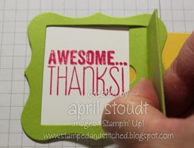
This is the other card we made a club this month.  It's an interactive card that uses the Peekaboo Frames Die.  Below is the card once the tab is pulled.  Fun, isn't it?  
I'm going to attempt a photo tutorial, and I'll admit right off the bat that it leaves much to be desired.  But you'll show me some grace, right, and just be happy for my attempt?  Thanks!  OK, ready?  Here goes...


The first thing you'll want to do is cut a standard card size in Pear Pizzazz and score it.  Cut a piece of Gingham Garden Designer Series Paper (DSP) to 4" x 5-1/4" and adhere it to your card.  You'll notice that I made three different variations of this card with different papers in this pack.
Yes, I took a picture of DSP on card stock, but don't have one for the next step.  Because no one knows how to adhere DSP to card stock.  Really, I don't think any of you are really that dense.  Next up, you'll want to cut out a piece of card stock using your Big Shot and the Peekaboo Frames Die.  Use the shape that looks like a big Curly Label Punch.  It's in the corner of the die.

After cutting, you'll need to score.  Get out your handy dandy Simply Scored Scoring Tool and line it up as shown below.  You'll want to score at 3/4" and 1-5/8".
Use your bone folder to fold on the two score lines you just created, as well as the original line made by the die itself.  Set that aside for a few minutes.

Take a piece of Daffodil Delight card stock, cut to 3-3/4" x 1-3/4" and insert one end into the Decorative Label punch as shown below.  This allows you to cut one end, leaving the length of the strip intact. 


After punching the end of your pull tab, stamp an arrow on the punched end.  I used one of the tiny arrows from the Designer Typeset Photopolymer Stamp Set.  I love how the stamp shows the color ink that you use.  Yes, I get excited about the little things.
Here's how it looks once it's been stamped.  This will indicate to the recipient that they should pull on the tab...you know, so they aren't completely confused about what they are supposed to do with your card.
OK, it's important to pay attention to this step.  Cut a piece of Whisper White card stock 2-3/8" x 2-1/4" and stamp your sentiment slightly to the left.  Do not do this:
 It should look like this...see how it's not centered, but slightly to the left?
And now it's time to start putting the whole thing together.  Place a piece of sticky strip on the front of the Daffodil Delight strip.  Be sure it's on the same side as the arrow, but at the other end.  Attach this to the back of the Pear Pizzazz piece.  It will adhere to the part with the little notch in it.  I've shown it here from the back and again how it looks from the front.  Don't worry that the Daffodil Delight is showing through...we'll take care of that later.


Now that you have that done, it's time to attach your sentiment.  The best adhesive for this step is Glue Dots.  Feel free to use whatever adhesive you like, but don't say I didn't warn you.  Put a glue dot right at the point of each corner, on the back of the Pear Pizzazz piece, as shown here:
Try to get the glue dots as close to the inside opening as possible, but don't stress about it.  These dots will be used to attach the window to the Whisper White piece that's stamped with the sentiment.  You have a little bit of play, so make adjustments if you accidentally stamped crooked. 
I find that it works best to pinch the window open while doing this...it makes centering the sentiment a bit easier.  Be sure not to get any adhesive between the Daffodil Delight card stock and the Pear Pizzazz card stock.

Go ahead and adhere this to the front of the card.  Keep your adhesive to the Pear Pizzazz and Whisper White.  Again, don't get any adhesive on the Daffodil Delight or the pull tab won't work.
Are you hanging in there?  The hard part is behind you and it's easy peasy from here on out.  You'll need a piece of Whisper White cut to 1-1/2" x 1-3/4" and a piece of Daffodil Delight cut to 2-3/8" x 2-1/4".  Stamp one of the splotches from Gorgeous Grunge in Daffodil Delight on the Whisper White card stock, then adhere that to the Daffodil Delight card stock.
To adhere this piece to the window, put adhesive only on the panel shown below.  If you put it on the entire thing, the window won't open and then you'll have to start all over.  You don't want that.
Next up is a step that I neglected to photograph.  Cut a teeny piece of Whisper White to 5/16" x 2" then cover it with a piece of Gingham Garden Designer Washi Tape.  I used the floral, but any of them would look great.  Put some adhesive on the smallest part of the window (the part with the notch.)
Place your Washi Tape covered card stock on that section.  It should cover the notch and go right up against the Daffodil Delight piece.  Once done, embellish with an Island Indigo butterfly cut out with the Beautiful Wings Embosslit and the Big Shot.  Use a Stampin' Dimensional so it pops. 
One more thing...if you'd like to add a little something to the inside of your card, stamp it with the Gingham wheel.  Since you're just going the width of a card, you can ink it up with an ink pad instead of a cartridge.  Just be sure to do your stamping on some grid paper, and not on the Simply Scored Tool, as it looks like I'm doing here. :)
And that's it...you're done!  I'd love to see your samples...be sure to add a link in the comments if you make one!  Or, email a picture of it and I'll feature it here!

Supplies

Stamps:  Gorgeous Grunge, Designer Typeset Photopolymer Set, and Gingham Wheel
Ink:  Pear Pizzazz, Melon Mambo, and Daffodil Delight Classic Ink
Paper:  Pear Pizzazz, Daffodil Delight, Island Indigo, and Whisper White card stock, Gingham Garden Designer Series Paper
Accessories:  Big Shot, Beautiful Wings Embosslit, Peekaboo Frames Die, Gingham Garden Designer Washi Tape, Clear Block A, Decorative Label Punch


Monday, October 28, 2013

Easy Washi Tape Card

I'm finally getting around to posting the cards we made a club...over a week ago!  This month I featured the Gingham Garden suite of products, and this card showcases the Designer Washi Tape wonderfully!  I saw this card by Mindy Backes and knew it would be the perfect card for club.  Our other card was a bit more involved, so I wanted to be sure this one was quick and easy.  And it is!  With Stampin' Up!'s variety of Designer Washi Tape, it could be replicated for all kind of occasions.  In fact, I'm pretty sure I'm going to make a Christmas variation of this card.

Tips & Tricks

  • Stamp before adhering the Washi Tape.  It's just easier that way. :)
  • Washi Tape is great, because if it's not lined up right where you want it, just peel it off and try again.   
  • After punching our your card stock with the Decorative Label punch, you may want to snip off the points at the top and bottom.  They just kind of look weird sticking out from behind the oval.  You can leave the ones on the ends...those look fine!
Supplies

Stamps:  Yippee-Skippee and Gorgeous Grunge
Ink:  Daffodil Delight and Melon Mambo Classic Ink
Paper:  Melon Mambo, Island Indigo, and Whisper White card stock
Accessories:  Daffodil Delight Seam Binding Ribbon, Gingham Garden Designer Washi Tape, Decorative Label Punch, Extra Large Oval Punch, Paper Snips


Friday, October 25, 2013

Mosaic Madness...for Christmas!

When I first saw Mosaic Madness, I wasn't exactly thinking Christmas.  But this versatile set makes great Christmas ornaments, which was perfect for my Christmas Card Stamp-a-Stack

This card has a definite wow factor, thanks in part to both the Circle Card Thinlits, as well as the Silver Glimmer Paper.  It looks complicated, but is really quite a simple card.  You've got to love deceptive cards like that!

Supplies

Stamps:  Mosaic Madness and Christmas Greetings (retired)
Ink:  Silver (available in the Holiday Catalog!) and Pool Party Classic Ink
Paper:  Pool Party and Whisper White card stock, Winter Frost Designer Series Paper Stack, Silver Glimmer Paper
Accessories:  Big Shot, Circle Card Thinlits, 2-1/2" Circle Punch, Mosaic Punch, Whisper White Baker's Twine

Wednesday, October 23, 2013

Christmas Stamp-a-Stack Card {Ornament Keepsakes)

This card is one from my Christmas Card Stamp-a-Stack this past weekend.  This card is elegant, yet very simple, and is an easy one to mass produce.  The combination of sponging, Linen Thread, and the color choices of Naturals Ivory, Always Artichoke, and Cherry Cobbler give this card a very vintage look.

Tips & Tricks

  • Since the Pretty Print Embossing Folder tends to weaken the card stock a bit, I find that it's easier to sponge the edges of that piece before it makes a trip through the Big Shot.  The sponging that's done on top of the embossed image will need to wait until after, though.
  • Love the look of banners?  They are a great way to use up scraps.  There's no need to cut a strip of card stock the full width as shown here.  Simply snip the banner ends of a small scrap and tuck it behind the image.  No one needs to know that the card stock doesn't extend the full way across!
Supplies

Stamps:  Ornament Keepsakes, French Script (retired, but En Francais is a perfect substitute!)
Ink:  Cherry Cobbler, Always Artichoke, and Crumb Cake Classic Ink
Paper:   Naturals Ivory, Very Vanilla, Always Artichoke, and Cherry Cobbler card stock
Accessories:  Big Shot, Pretty Print Embossing Folder, Holiday Ornaments Framelits, Labels Collection Framelits, Sponge

Monday, October 21, 2013

Oh, Hello!

This is one of the cards that I made to send to one of my college roommates for her 40th birthday.  I think she'll like it...at least I hope she does!  I think that Oh, Hello and Gorgeous Grunge are a match made in stamping heaven.  I love how these two sets work perfectly together.  I'm also in love with this year's In Colors, especially Baked Brown Sugar, Crisp Cantaloupe, and Pistachio Pudding.  And I am shocked by that last one.  There really aren't words to describe how much I hate mint green.  Remember Mint Medley?  Oh, how I hated that color.  I danced with joy when that retired.  I think it's because as a child, the walls in my dentist's office were that color, and I absolutely hated going there.  I had more things done to my mouth during my growing up years than any kid should have to endure.  Unfortunately, I think my oldest daughter is following in my footsteps.  It's much harder to watch your child go through that stuff than it ever was to endure it myself! 

Anyway, my dental issues seem to have influenced how I feel about mint green, so I think you can understand why I was so shocked to realize that I really do love Pistachio Pudding!  It's a more updated "mint" and not minty at all, which is probably why I like it. 

Tips & Tricks

  • Now that the novelty of the Simply Pressed Clay and Molds has worn off, I'm happy to report that I still use them all the time!  The embellishments they add to any card are so affordable, and I love that they can be customized to match any project.  The only negative is that you can only make three buttons or flowers at a time.  But did you know that if you stick the molds in the freezer for about 30 minutes (in a deep freeze...a fridge freezer may take a bit longer), the clay will (temporarily) harden long enough to pop out of the mold?  You can then set them aside to dry, and free up the mold for more clay.  
  • I always try to make extra buttons and flowers when I dye clay.  I keep the extras in old embellishment containers (you know, those round containers that buttons, brads and other items come in.)  It's a great way to reuse empty containers, and have beautiful embellishments ready for your next project!
Supplies

Stamps:  Oh, Hello and Gorgeous Grunge
Ink:   Sahara Sand, Baked Brown Sugar, Crisp Cantaloupe, and Pistachio Pudding
Paper:  Baked Brown Sugar and Whisper White
Accessories:  Big Shot, Ovals Collection Framelits, Simply Pressed Clay and Molds, Whisper White Baker's Twine

Wednesday, October 16, 2013

So Sorry {Circle Card Thinlits}

Soft and subtle is always the way to go when making a sympathy card, and these two patterns from Sweater Weather Designer Series Paper are just that.  The two colors, Tangerine Tango and Sahara Sand, also happen to be a great combination on the tree/branch image from Thoughts & Prayers
It's good to keep sympathy cards simple, as well.  Someone once told me that the most meaningful card she received when her father passed away was one from a family friend that simply read, "I'm so sorry."  She knew that sentiment was heartfelt, and no other words were needed.  Now, this card allows for room to write a few more words than that, but if you speak from the heart, long sentiments aren't necessary.

Tips & Tricks

  • One of the very first techniques I learned was to use markers!  I stamped the entire image in Sahara Sand, then colored the flowers right on the rubber with my Tangerine Tango marker.  If using two darker colors, don't layer your colors!  You'll end up ruining the tips of your markers.  However, it's perfectly fine to use a darker marker over top of a lighter color ink.
Supplies

Stamps:  So Sorry, Thoughts & Prayers
Ink:  Sahara Sand and Early Espresso Classic Ink, Tangerine Tango Stampin' Write Marker
Paper:   Sahara Sand, Tangerine Tango, and Naturals White card stock, Sweater Weather DSP
Accessories:  Big Shot, Circle Card Thinlits, Houndstooth Embossing Folder, Pearls Basic Jewels, 2-1/2" Circle Punch

Monday, October 14, 2013

Day of Gratitude Emboss Resist Card

Today is my 18th wedding anniversary, so I thought it would be fun to show the card I made for my husband.  I used the retired Day of Gratitude set, which is fitting, since I am filled with gratitude to be celebrating 18 happy years of marriage today!

I love this set, and thought it would be fun to try the emboss resist technique with it.  It turned out a bit more colorful than I was hoping...I think there are more fall colors on this card than I'm seeing on the trees this year.  I'm not sure what's going on around here, but where are all the pretty leaves?!

Tips & Tricks

  • Emboss resist is such an easy technique.  Simply stamp and emboss your image.  I used VersaMark on Very Vanilla card stock and embossed with clear embossing powder.  Then dab a sponge on the ink pad of your chosen color, and kind of swirl it around on your card.  I used several colors and just randomly chose where to rub the sponge on the card.  I went back and filled in with Crumb Cake at the end, so be sure all the empty spaces were filled.
  • Sponges are super inexpensive, and even more so when you cut them into fourths.  I set aside 1/4 of a sponge for each color ink, then slide them in a tiny cellophane bag labeled with the color name.  I never have to worry about accidentally using the wrong sponge in my ink pads!
Supplies

Stamps:  Teeny Tiny Wishes, Day of Gratitude (retired)
Ink:  Cherry Cobbler, Cajun Craze, Crushed Curry, Old Olive, and Crumb Cake Classic Ink, VersaMark
Paper:  Soft Suede, Old Olive, and Very Vanilla card stock
Accessories:  Big Shot, Woodgrain Embossing Folder, Simply Pressed Clay and Molds, Linen Thread, Clear Embossing Powder, Heat Tool